The Seq dashboard is generally used for charting values over time. There are a few monitoring scenarios, though, in which a single value of some measurement is most important:
- Is a remote endpoint up, or down?
- Which cluster node is the leader?
- When did the latest backup complete?
Seq 4.1 introduced a new chart layout just for these cases.

It's straightforward to use if the value you're interested in is a count, sum, min, max, mean or percentile, since these are the same familiar aggregations that drive the other chart types. You might not be as familiar, however, with a couple of more 'exotic' functions that can be used to create value charts.
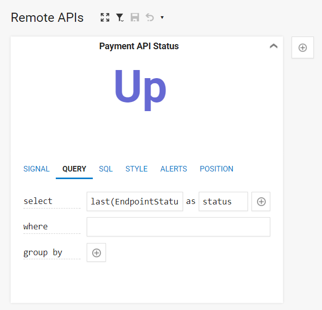
The last aggregation returns the value of an expression against the latest event in a group. For example, if the event stream carries EndpointStatus values from a health check:
Log.Information("Endpoint is {EndpointStatus}", up ? "Up" : "Down");
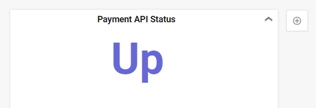
Then last(EndpointStatus) is the current status:

With the appropriate select clause in place, laying out the chart is just a matter selecting Value as the display style, under the Style tab.
Note that last returns precisely the most recent value, even if that turns out to be null. If the expression only has values for a subset of events, adding a where clause like EndpointStatus is not null will show the last non-null value.
Though it's less broadly useful, first is the counterpart to last for retrieving the earliest value of an expression.
Happy logging!