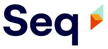
TL;DR: We're rolling out an all-new logo. We hope you like it!
A fun side-benefit of publishing open source software is that you get to choose, or make, the project's logo. Having had some hits - and misses - through various open source projects over the years, I had some experience behind me when I sketched out Seq's original logo just a few nights before the first preview was announced, in late November 2013.

The logo has grown on me, and it's perfectly usable, especially after a clean-up and re-drawing for Seq 4.0 in early 2017. I can't help being fond of it, since it represents a product and community I love.
If you didn't know anything about Seq, though, and saw the current logo for the first time, you might assume it belongs to something fairly... bland.
People often tell us that Seq brings something special into their day. It's the most exciting thing I can remember working on! Our logo should be fresher, brighter, and bolder, if it's going to represent what Seq is all about.

We think the new Seq logo delivers. It's built around a prismatic diamond motif that captures some sparkle, and it's integrated into a colorful and distinctive visual style that you'll see us rolling out over the coming months.
The new Seq logo was drawn by DSR Branding, who share our love of design, and who didn't mind spending hours with us poring obsessively over drafts and sketches.
Seq empowers developers with clarity, which we sought to translate into a visual identity. The diamond icon represents illumination and insight, symbolizing Seq’s ability to crystallise problems in order to solve them quickly. — DSR
We hope you'll come to enjoy the new logo as much as we already do.
Happy logging!