TL;DR: Heatmaps are a great way to visualize timing data over time.
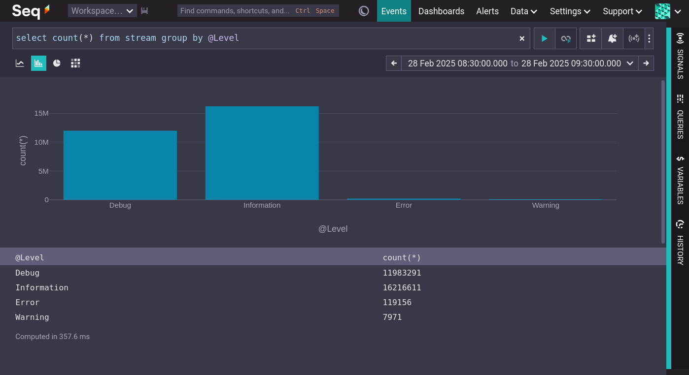
The canonical visualization of two dimensional data is the bar chart. The following screenshot shows a count of events at each logging level.
To view these data by minute introduces a third dimension, which the bar chart cannot represent.
The heatmap is a new Seq visualization that renders three dimensional data by encoding the third dimension as a color intensity.
Here is the count of events by @Level per minute.
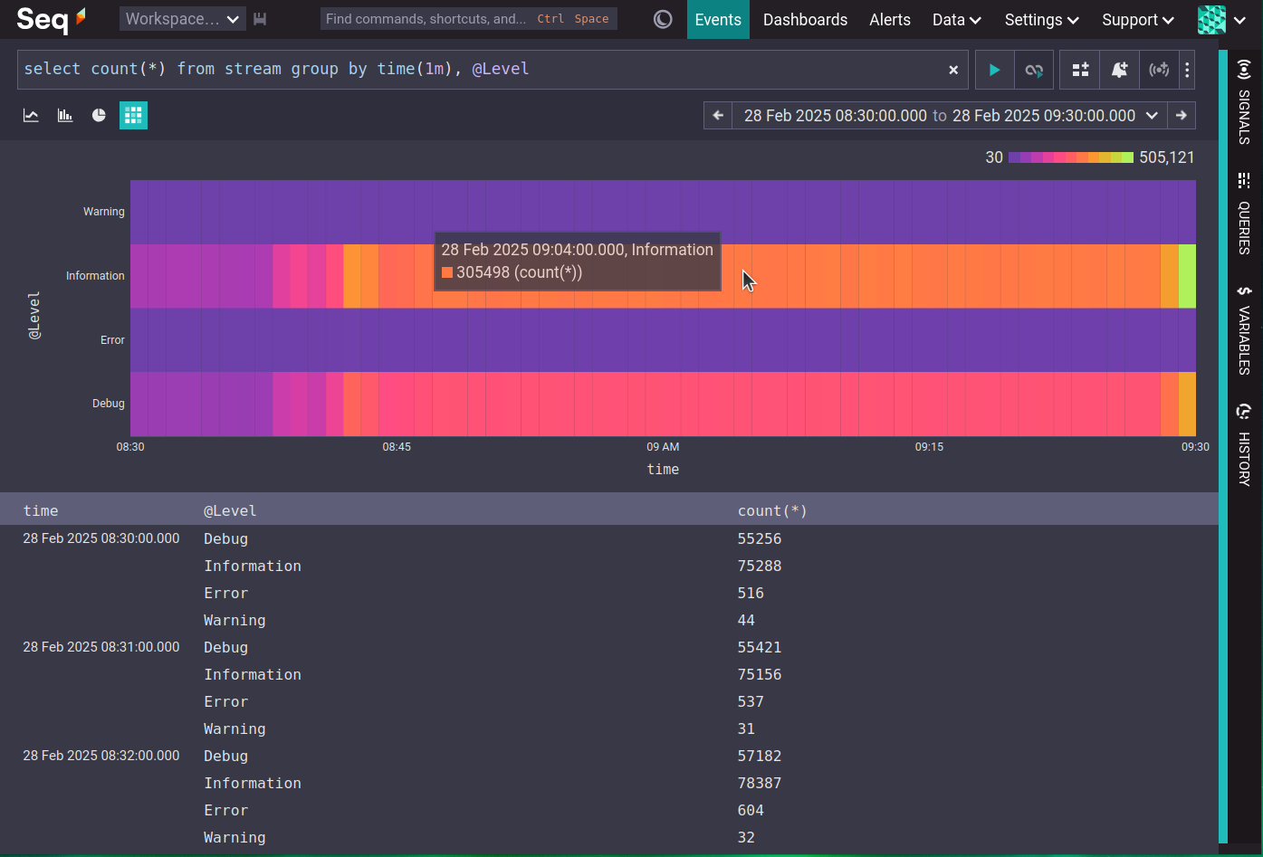
The heatmap visualization is available for any query result with three columns, with the last column being numeric. A tooltip includes the precise values of each dimension.
Seq is the private, secure, self-hosted server for centralizing structured logs and traces. Ingest diagnostics from OpenTelemetry and other log sources, then monitor applications and hunt bugs using an ergonomic query language and full JSON data model — without any data leaving your infrastructure.
Heatmap of @Elapsed
For events that include an @Elapsed value, a heatmap visualization is available directly on the Events page.
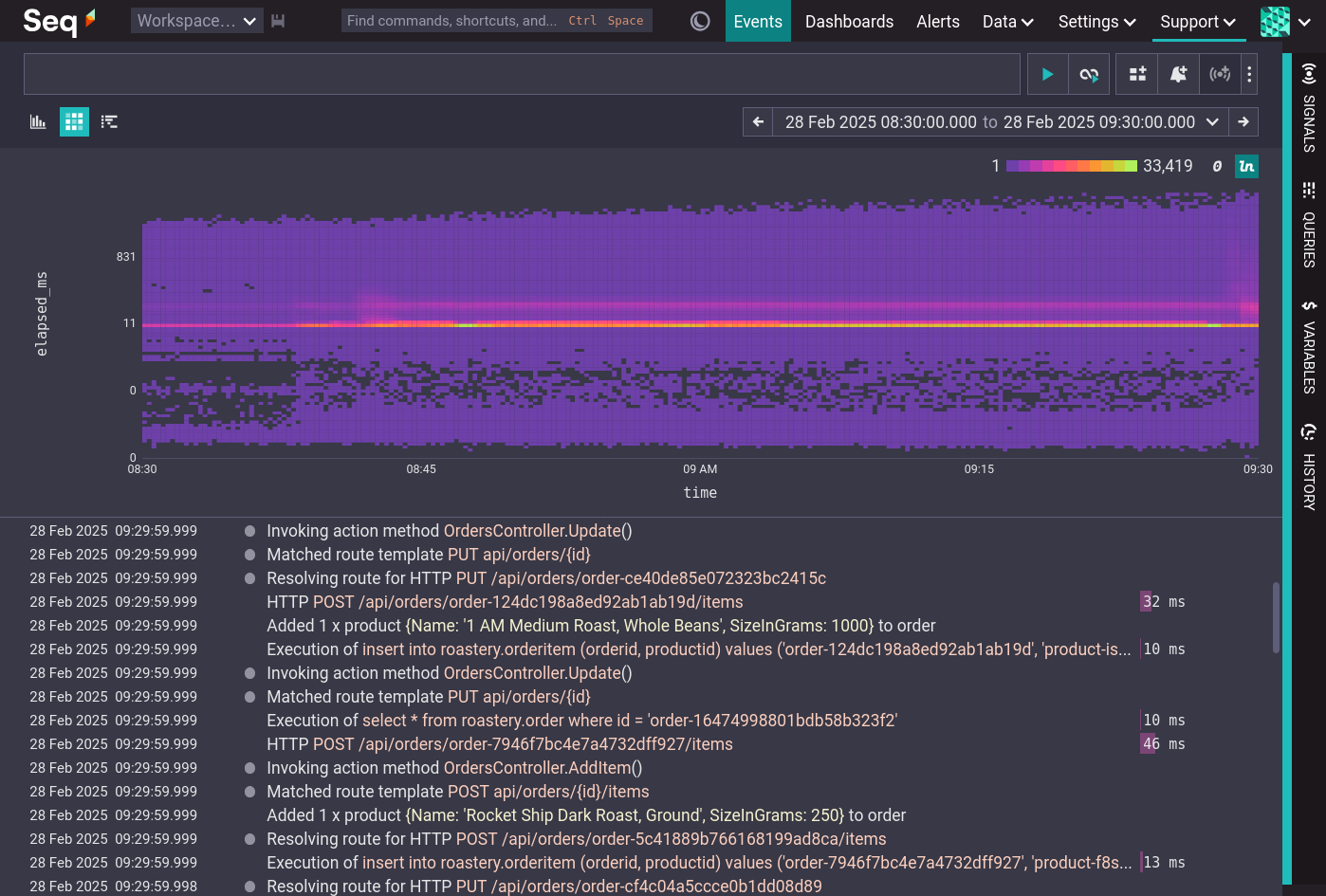
This shows the distribution of @Elapsed times, and how the distribution changes over time.
Histograms and heatmaps of numeric properties
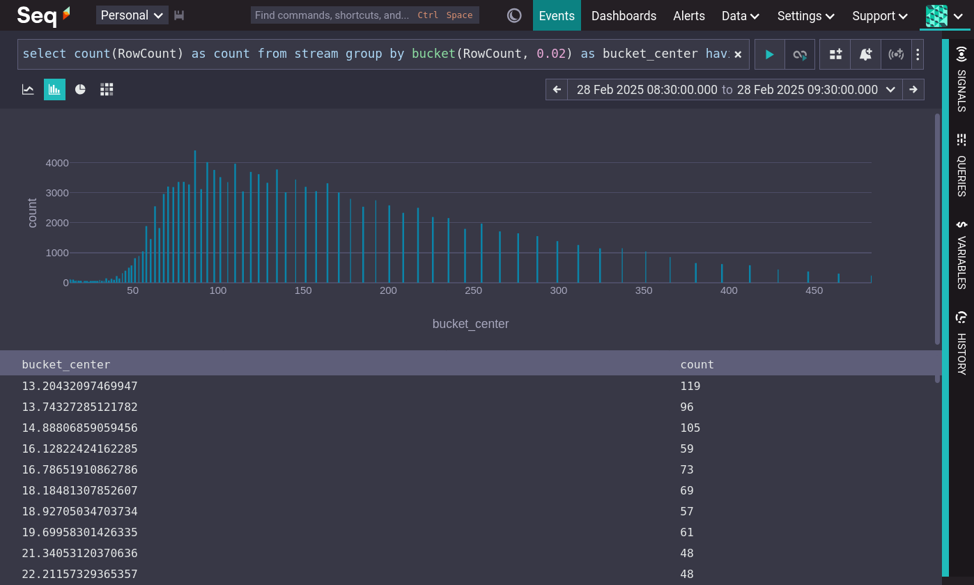
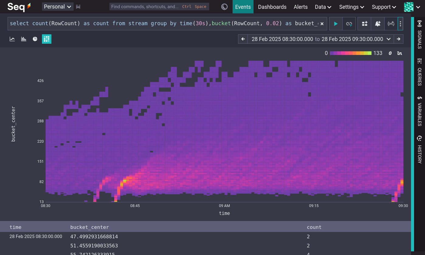
Seq has new 'Plot histogram' and 'Plot heatmap' menu actions for numeric properties.
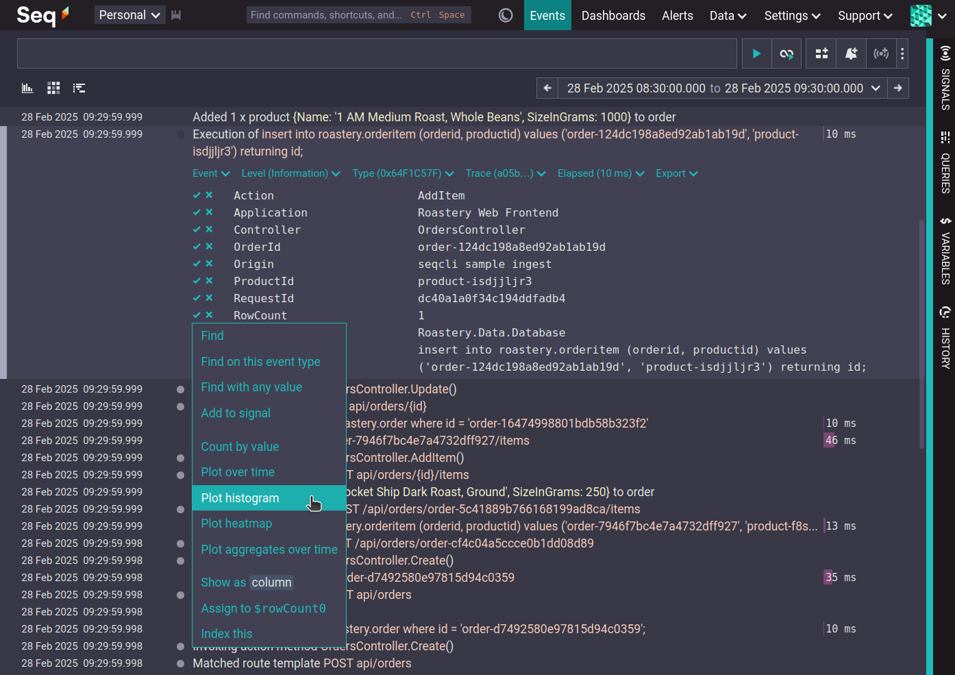
'Plot histogram' produces a bar chart showing the distribution of values for the entire time range. 'Plot heatmap' produces a histogram showing the distribution of values over time.
The following screenshots show the histogram and heatmap for a sample data set.
Both show the same data, and both are correct.
The histogram shows the average distribution across the entire range, with the frequency of values increasing rapidly to around 80 and then decreasing linearly to 500.
The heatmap reveals that the distribution is not constant over time. It begins relatively even, then develops some hot spots, before gradually moving higher over time.
The bucket function in the queries above maps values into the nearest logarithmic bucket, with the size of the buckets, and hence the amount of error, determined by the bucket function's second parameter.
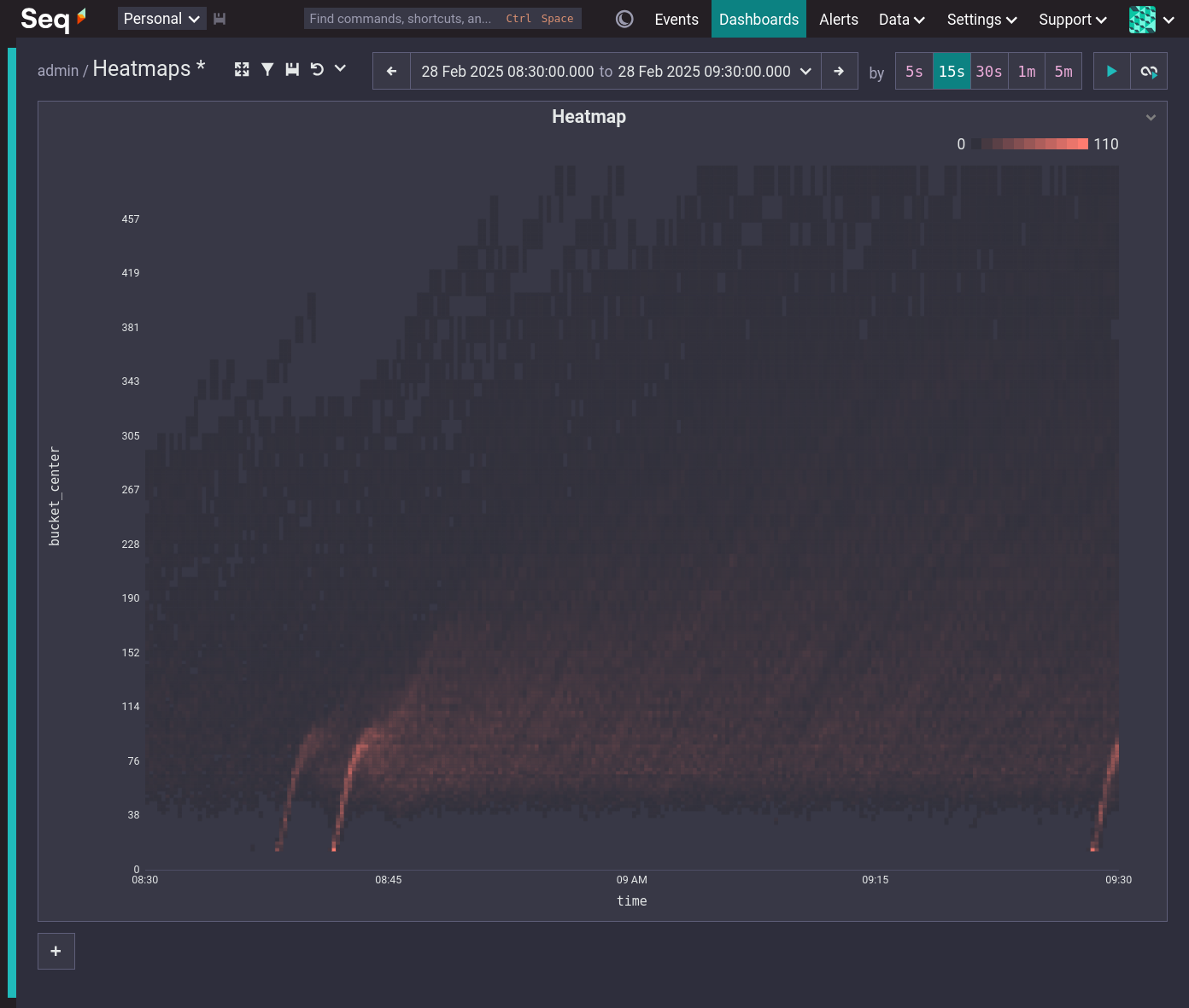
Heatmaps on dashboards
Like the other visualization types, heatmaps are available on dashboards.
To include a heatmap on a dashboard, construct your query then use the 'Add to dashboard' button or add a chart directly to the dashboard. Dashboard heatmaps can use any of the standard dashboard color palettes as well as the special heatmap palette.
Get started with heatmaps
Seq 2025.1, including heatmaps, is now RTM: grab the binaries from https://datalust.co/download or pull datalust/seq from Docker Hub.