Signals are one of Seq's most important and useful features. Activating and combining signals can very quickly limit a search or query down to a narrow stream of relevant events.
The signal bar is the right-hand pane of the Seq UI where signals can be activated and deactivated. With just a few signals, everything is neatly organized there, but when the total number of signals is large, a few problems emerge:
- The activated signals can be scrolled off-screen, making it difficult to quickly determine which filters are being applied to the current search or query,
- The query list, beneath the signal list, can end up scrolled off-screen, making saved queries an oft-forgotten feature,
- The editor pane that appears when editing a signal or query can end up scrolled off-screen, making it awkward to start editing a signal far down the list, and
- There isn't much space there to add new functionality without more scrolling or clutter.
Seq 2022.1 will have an updated signal bar design that addresses these issues. We're really pleased with how it is coming together, so along with this sneak peak blog post, you can now download or docker pull a preview version of Seq 2022.1 and try it out!
Tool windows and the tab drawer
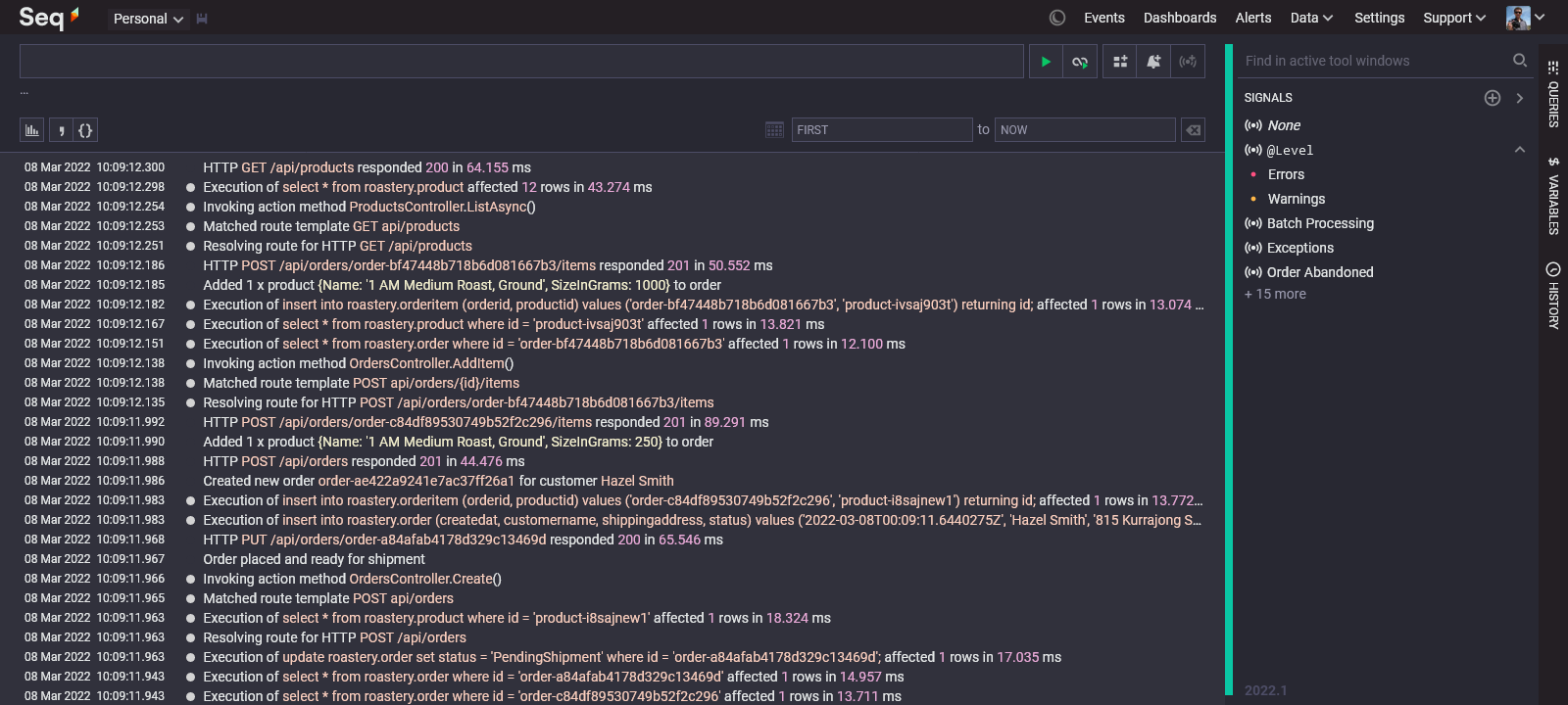
The first thing you'll notice about the Seq 2022 UI is the addition of a tab drawer along the right-hand edge of the screen. Signals, queries, and other tool windows show up there when they've been collapsed:

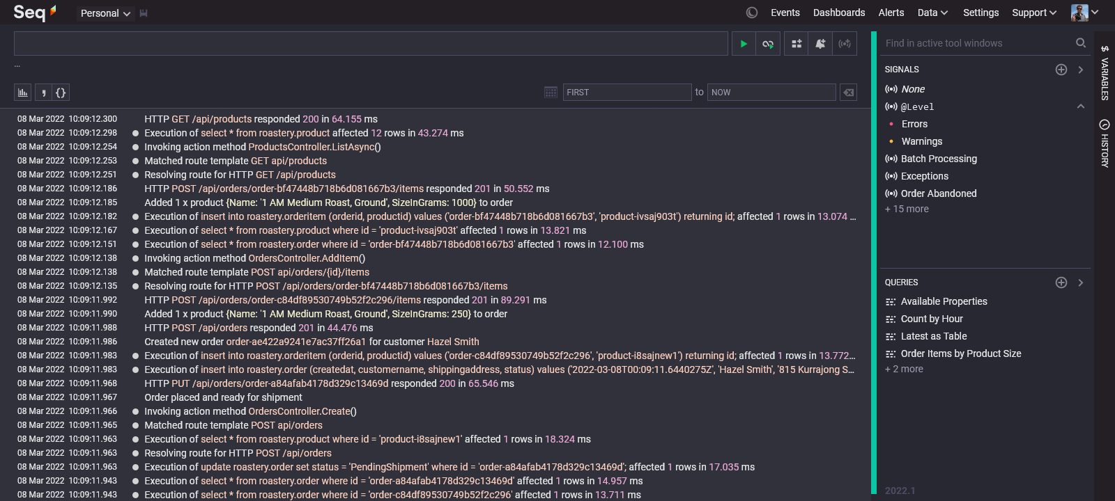
Clicking on one of the tool windows in the tab drawer will restore it into the signal bar:

Each tool window has its own content area and scrolls independently: you can keep the queries tool window on screen even when the signals window contains a large number of signals.
This new layout also neatly and consistently organizes features like the improved history window and the new variables window.
The editor window
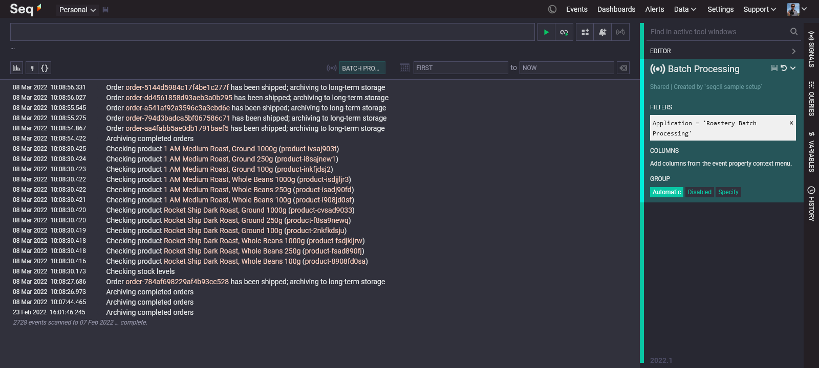
When a signal or query is being edited, the editor appears as an independent tool window that you can keep on screen, or collapse to the tab drawer.

This makes working with complex signals (with long lists of filters) much more pleasant.
The editor has also been streamlined: you no longer need to click "ok" to apply changes to the signal or query title, or to any of the filters within a signal. We're planning some further changes to the editor to better take advantage of the increased screen real estate available for it.
Activated signals
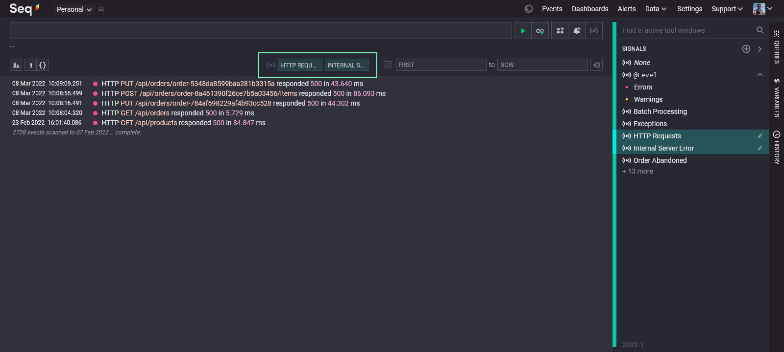
When a signal is activated, it now appears in a list beneath the search box:

This keeps all of the information about the scope of the current query - the date range and selected signals - in the one place. It's much easier to tell which signals are applied at a glance, and clicking on a signal here will deactivate it, saving the need to scroll through a long signal list.
When can I get it?
A preview build of Seq 2022.1 is availble for Windows via the Seq downloads page, and you can grab a preview container for Docker/Linux by pulling the datalust/seq:preview tag.
We're finishing up the release now, with a few small items yet to add and some polish to apply. If all goes to plan you'll have an RTM build in your hands in late March 2022.
We'd very much appreciate your feedback on the changes, either here, on the discussion forum, or via our support email address. Thanks for taking a look!