Telemetry data often includes numeric values that change over time. This is roughly the definition of an observability 'metric'.
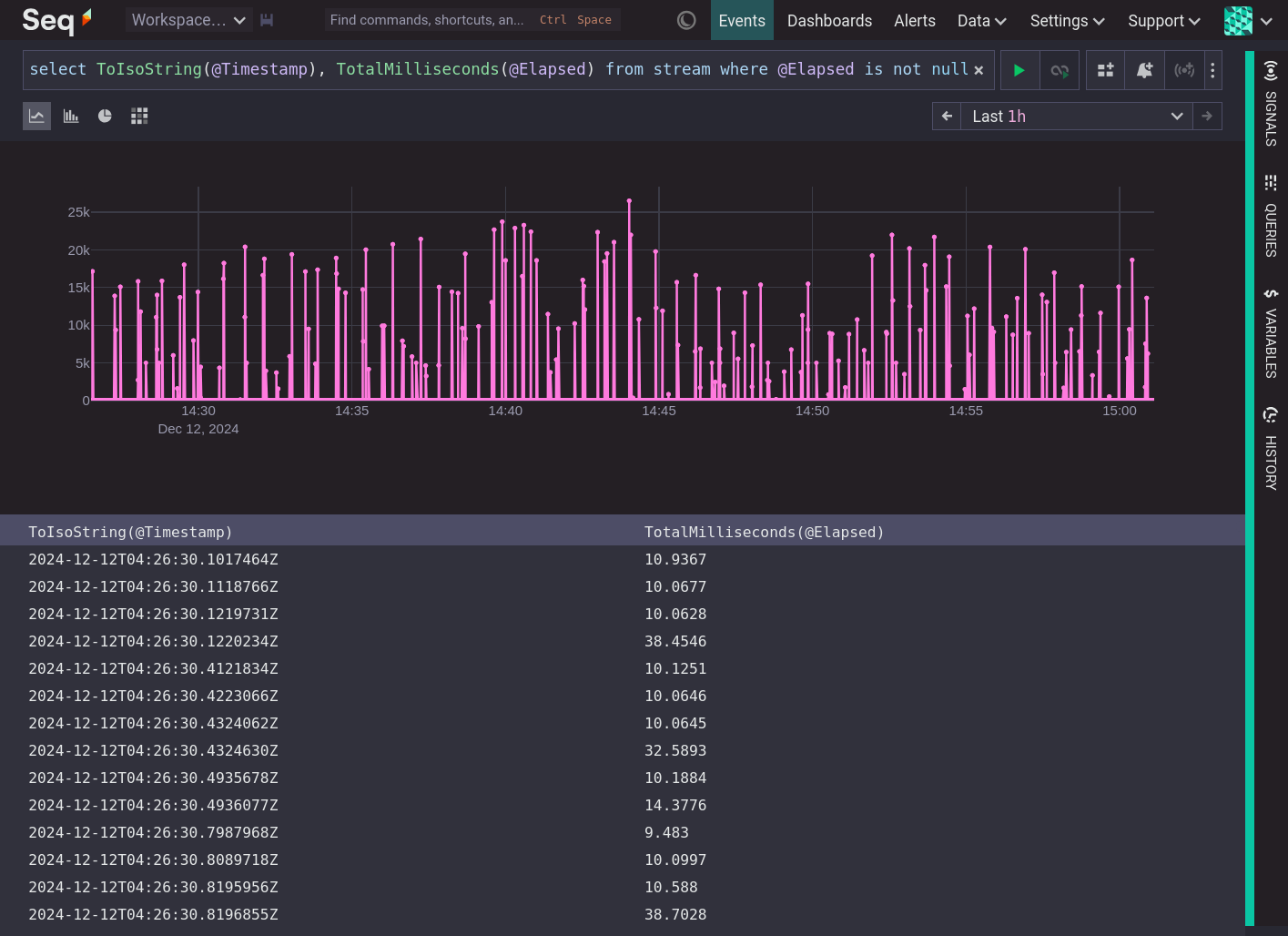
It is difficult to infer anything useful by looking at the values of a metric over time. People are good at detecting patterns in sounds and images, but not in lists of numbers. Can you tell what is happening in the system below from this time series of elapsed time values?
For a metric to quickly convey meaningful information about the state of a system we need to produce summaries.
Summarizing Metrics with Statistics
Statistics are the mathematical tool for summarizing a set of values. For example, the mean, aka average, is the sum of the values dived by the number of values. It is one measure of the midpoint of a list of values. By itself, mean is insufficient to describe a list of values, because it includes no information about the variance (how far the numbers are spread out from their average) or distribution. The lists {9,10,11} and {1,1,21,17} have the same mean (10) but different distributions. The mean is useful, but we need other statistics that capture more information about the shape of the data.
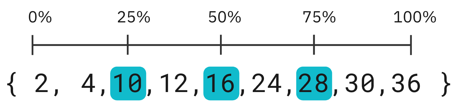
Percentile gives the value a certain distance through the list, i.e. percentile(@Elapsed, 25) is the value of @Elapsed 25% of the way from the smallest to the largest. percentile(@Elapsed, 50), also known as the median, gives the value halfway through the ordered list of values, and percentile(@Elapsed, 75) gives the value 75% of the way through the list.
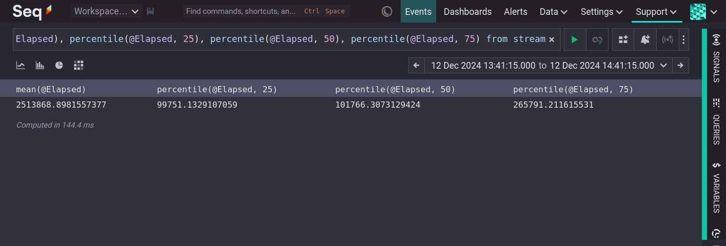
With these statistics we can start to infer something about the shape of @Elapsed data. We know that half (25% to 75%) of the values occur between 99,751 and 265,792, and we know that there must be a small number of very large values to pull the mean so far above the median. These statistics are calculated over a sample that is an entire time range. However, when investigating the state of a system there is always a time dimension. We want to know if things are fast or slow, but also when they are fast or slow. The same statistics can be calculated repeatedly over equal sections of time. For example, once per minute, for one hour:
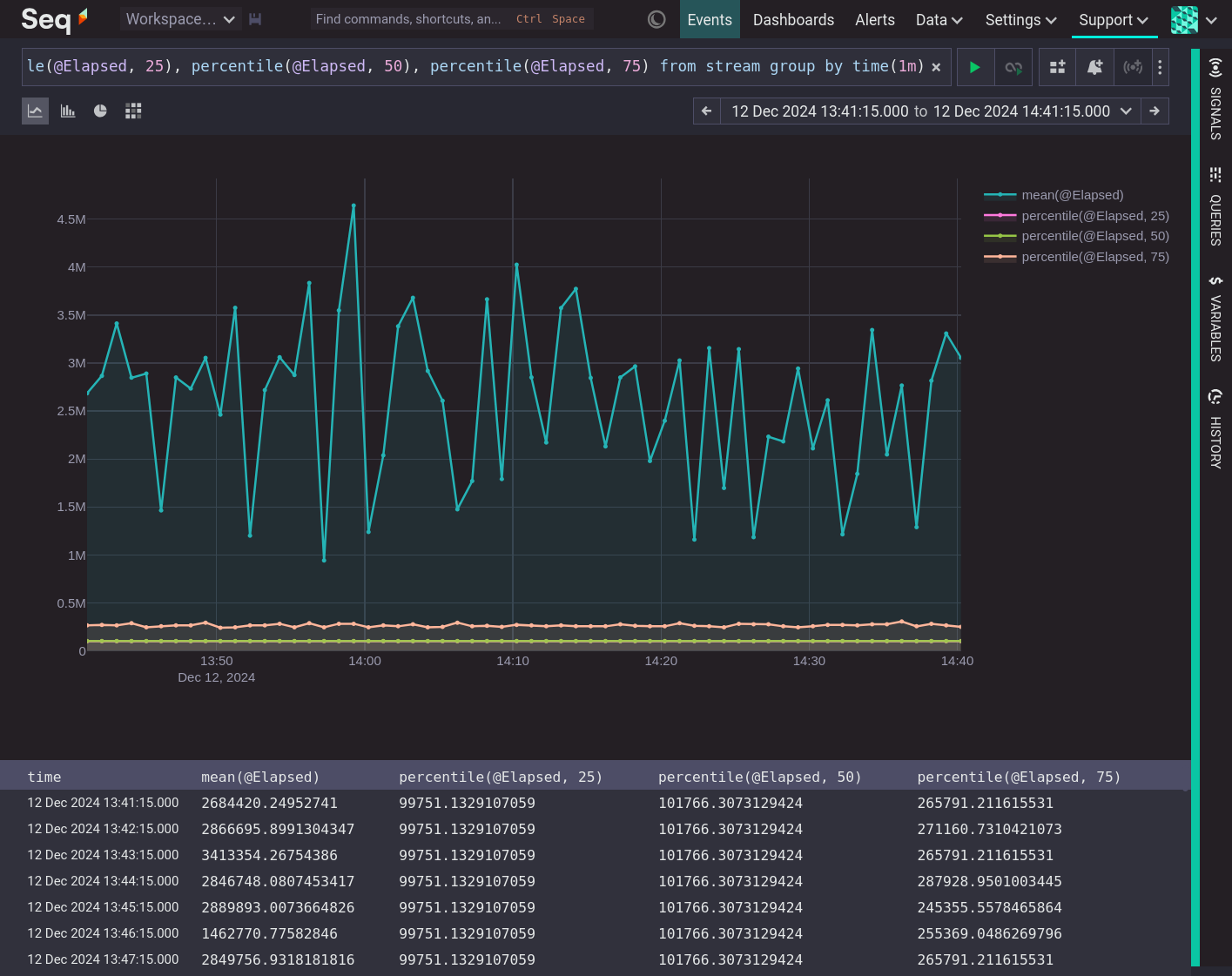
Calculating statistics over time shows summaries of the data and how those summaries changed.
Summarizing Metrics Visually
Data visualization is valuable because we are much better at detecting patterns in images than in lists of numbers. A useful visualization can be made by grouping values, calculating a summary statistic for each group and drawing that value as a bar. Looking at such a visualization we can easily compare the summary of each group and form an intuition about the shape of the data.
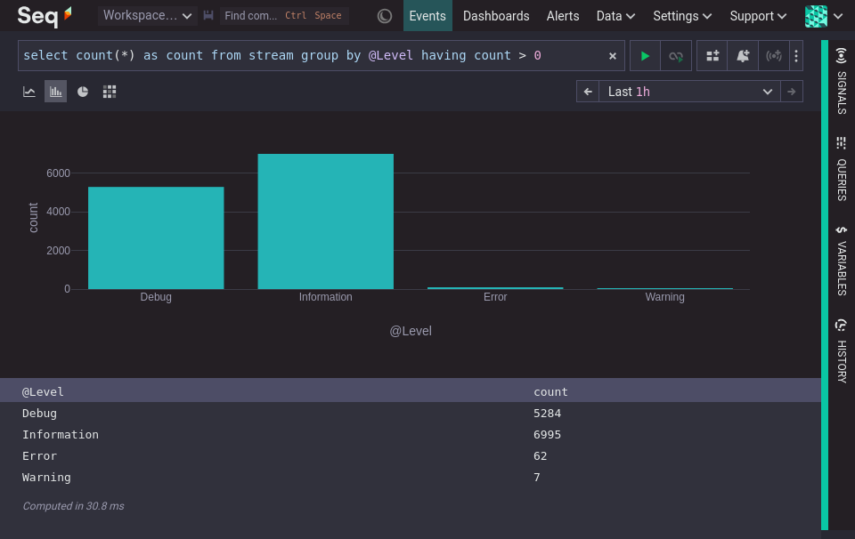
The following visualization groups events by the categorical variable @Level and summarizes using the count function. The visualization highlights that there are many 'Information' events, nearly as many 'Debug' events and then a small number of 'Errors' and 'Warnings'.
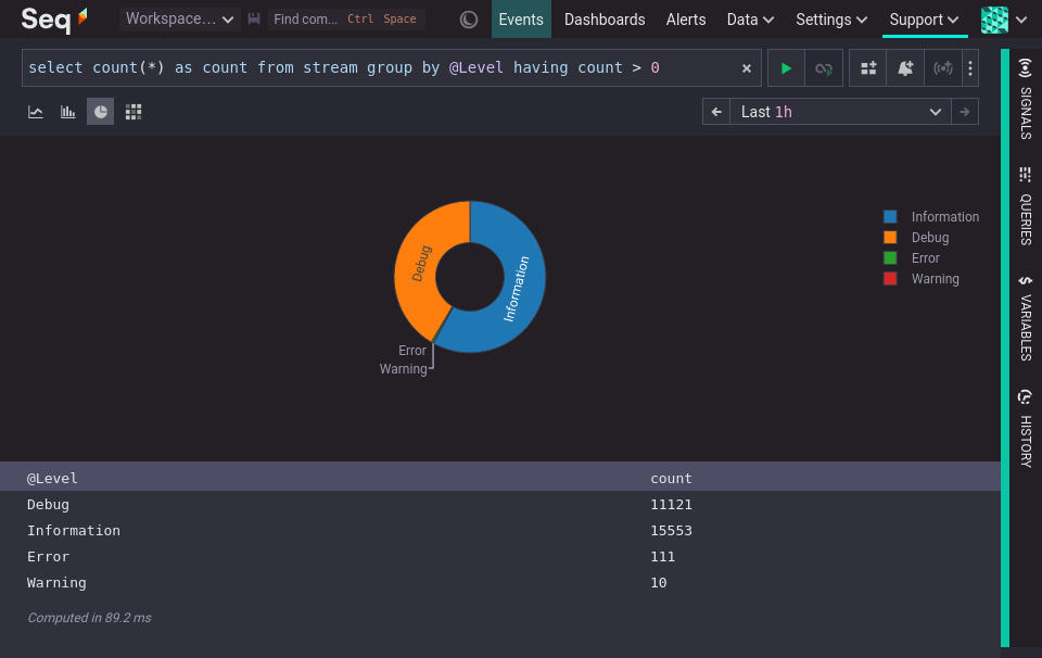
A pie chart can be used when grouping by a categorical variable, if the emphasis is meant to be on the ratio between a small number of categories, and the categories have no natural ordering, that is they are nominal, not ordinal.
Visualizing the distribution of numeric values requires an extra step, because numeric values are often continuous. For example, a person's age is a continuous variable that is often treated as though it were a discrete variable. We say we are 41 years old, not 41.375 years old (hypothetically). Grouping continuous values into discrete ranges simplifies that visualization so that it can be easily interpreted.
A bar chart showing the count of numeric values grouped into ranges is called a histogram.
Summarizing numeric data with histograms
Constructing a histogram of @Elapsed requires grouping the values (sometimes called 'binning'), thus converting a continuous variable into a discrete variable. There are many ways to group values into ranges. This example does it by rounding to the nearest whole second.
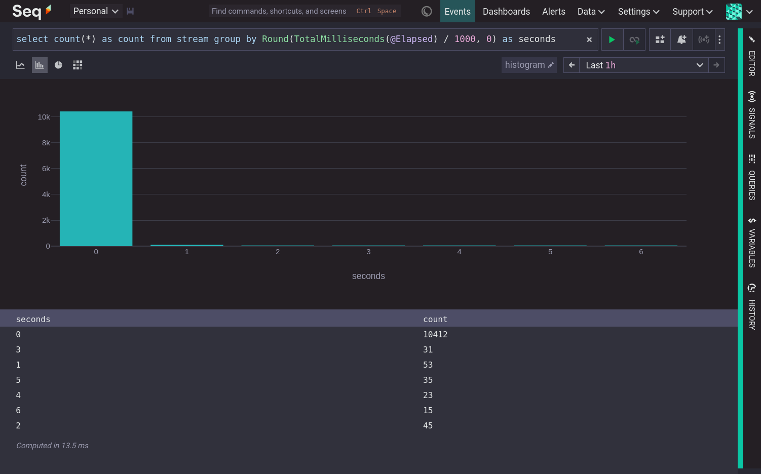
This visualization shows that nearly all @Elapsed times round to 0 seconds, and the remaining values are spread out between 1 and 6 seconds.
To understand why some operations are faster than others it can be useful to slice the data by another dimension, such as the RequestMethod property, which leads to a three dimensional result that is not suitable for a bar chart.
Summarizing numeric data with heatmaps
Heatmaps summarize numeric data that is grouped in two dimensions. For example, @Elapsed time grouped to the nearest whole number and by RequestMethod.
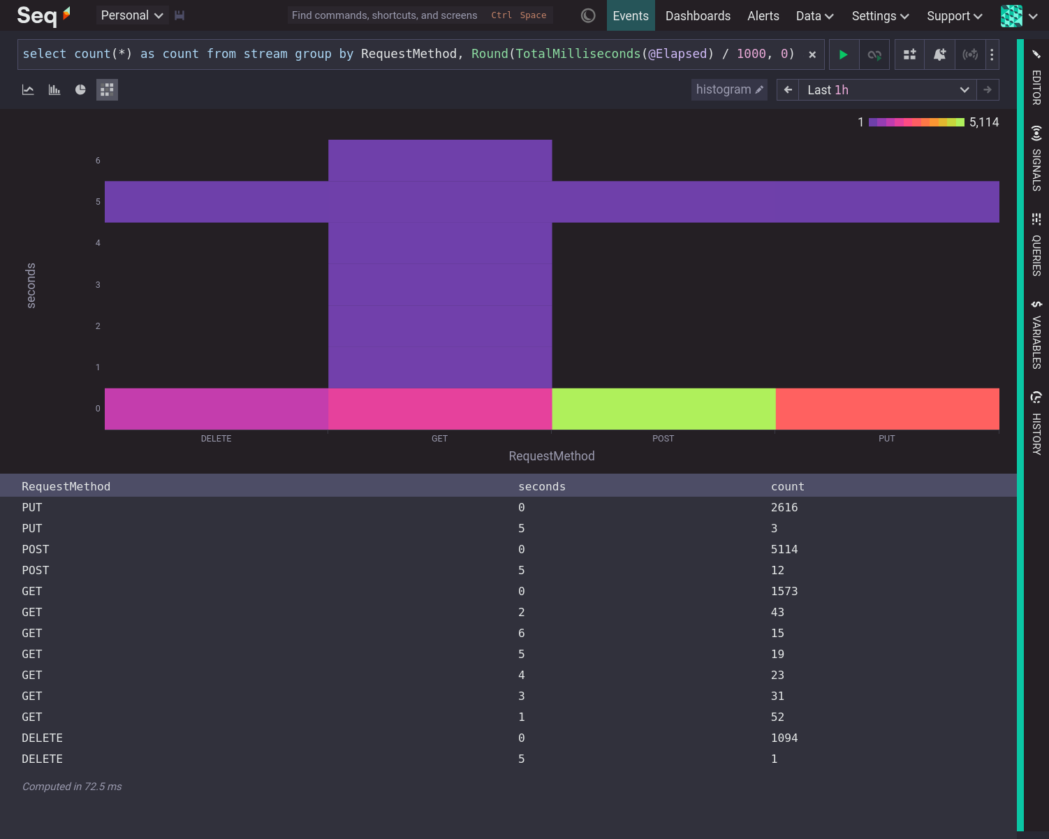
Each column of a heatmap is effectively a histogram on its side, with the magnitude represented by a color instead of the height of a bar.
The histogram showed that most values are clustered around 0 seconds. Slicing by RequestMethod with a heatmap shows that the long tail of @Elapsed times is mostly due to GET requests.
To make it easier to group values for histograms and heatmaps, Seq provides a Bucket function that groups values into the nearest bucket. Bucket has a second argument which determines the coarseness of the buckets. A number close to zero means very fine buckets. A number close to one means larger buckets. With the Bucket function we can produce a heatmap of @Elapsed (or any other metric) over time. This is the quintessential observability heatmap.
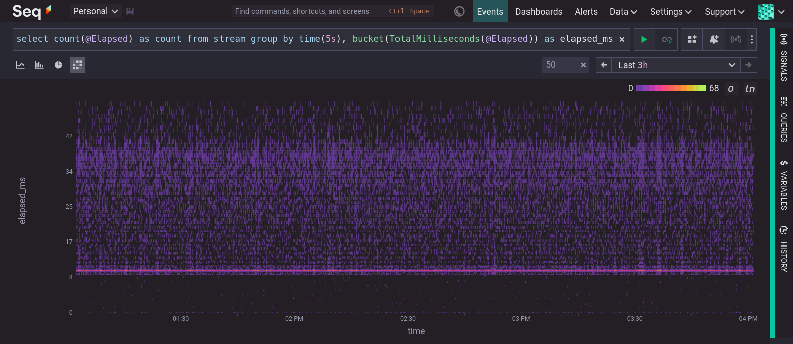
Some of the features of this heatmap are:
- The distribution is stable over time. Each 5 second time slice has a very similar distribution of values.
- There is a narrow peak at approximately 10ms. More operations took approximately 10ms than any other duration.
- A small number of operations took less than 9ms and are distributed between 0 and 9ms.
- There is a second, much less focused, cluster between 30ms and 40ms.
@Elapsedtimes are evenly distributed between 11ms and 50ms (excluding the features already noted).
Conclusion
Visualizations are extremely helpful when trying to extract patterns from numeric samples, like metrics.
If you have a list of numbers use a histogram to show the distribution of values.
If you have a set of groups, and each group is a list of numbers, use a heatmap to show the distribution of values within and across groups. Timing data (like latency, elapsed time, time to first byte etc.) grouped by time is a classic candidate for a heatmap visualization.